mio’s brand refresh highlights simplicity in the energy drink category
Tapping into the booming energy drink category, which has grown 71 percentage points since 2017, according to Mintel data, mio’s product line differentiates itself by delivering energy and flavorful hydration in a convenient, customizable format.
“Consumers need to have different beverages to deliver on different needs … and we are enabling through our product offering for consumers to only have one beverage that delivers on multiple needs,” Mills said.
Mills explained mio’s brand refresh – the first in 10 years for the brand– adds value to consumers who are “really good at drinking water” and using it as a vehicle to stay hydrated and energized throughout the day.
“We allow you to squeeze energy into your water, so you are getting that benefit of hydrating energy. That will continue to be the focus for where we bring new products to market moving forward. But, it is really about blending that transition from [being] not just about flavor, [but] … about functions, and that is our belief of where future growth is going to come from,” she explained.
The refresh spans across the brand’s portfolio, which includes its hydration and standard varieties. For its energy line, mio continued with its fruit-forward flavors, including Strawberry Pineapple, Black Cherry and Acai Berry made with caffeine and B vitamins. Each 1.62 ounce bottle delivers 60 milligrams of caffeine per squeeze (1/2 teaspoon).
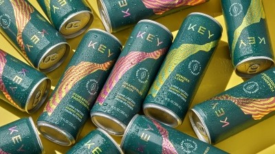
Setting a ‘contemporary’ tone with packaging design,cheeky ad campaign
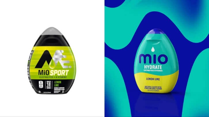
Transitioning from its sportier look with silver and neon coloring, mio opted for vibrant packaging to convey a “modern, contemporary, cheerful” tone that is “more reflective of the colorful sort of world that we are a part of,” Miller explained. The new branding also opens up space on the packaging by dropping the capital letters in MiO and switching to a lower-cased font.
Despite the limited real estate on the bottles, a “big intention and area of focus” was providing “color blocking with the use of icons” to make sure the directions are simple and easy to follow, she added.
The brand’s bold ad campaign highlights the product’s convenience by depicting a mio-branded tap faucet “designed to integrate into any kitchen, offering a revolutionary solution for those seeking an alternative to traditional energy drinks,” according to the brand’s PR statement.
“With our TAP launch, we are shaking up the energy drink game and reminding people that sometimes the simplest solution is the best,” Mills shared in the statement.
She continued, “We are here to show the world that energy drinks do not need to be complicated. They just need to make you feel good. Our vibrant TAP faucets prove that you can get that instant boost right from your kitchen sink – without the unwanted side effects.”