Brand Alchemy
Designing for impact: The balance between aesthetics and function
Within the food and beverage space, Cina’s award-winning designs and creative solutions span from multinational CPGs like Pepsi and Bacardi, to smaller brands, like indie coffee company Black Beach Coffee.
[Editor’s Note: Welcome to Brand Alchemy, a monthly multimedia series from FoodNavigator-USA that delves into the art and science of transforming products into brands. In this series, we will explore how strategic design, compelling marketing and creative packaging shape CPG products into lasting impressions that resonate with consumers and drive sales.]
For Black Beach, Cina’s design strategy was rooted in what the brand owners valued, which was a commitment to art and community engagement, he explained.
“One of the things we had talked about early on were a bunch of ideas about the arts and how to bring the arts into the packaging … and we had some great concepts originally, but … we could not communicate it through the packaging,” he said.
Initially, Cina’s idea for the iconography emphasized fine artistic imagery on the packaging, but despite working with “some of the best printers in coffee [packaging],” the result led to poor image quality and a high printing cost, Cina said.
“We could not replicate an artistic … clean image in a very sharp way. The printing on the coffee bags was so rough … so we could not capture that high detail that we were going for on a bag,” he explained, adding that it was back to the drawing board – or in this case, a blank white bag.
Creativity within constraints: How a blank white bag captured Black Beach Coffee’s artistic aesthetic
The blank coffee bag gave Cina more design flexibility as he could opt for other methods like hot stamping or stickers.
While hot stamping provided flexibility for the application of the design, it is better suited for metallic or foil colors and offers a limited color range, which did not align with Black Beach’s vision, Cina said.
Instead, Cina chose high quality stickers, which allowed him to re-imagine the iconography into abstract and organic shapes in an earthy color palette, he said. This preserved the visual integrity of the design while saving money and eliminating printing directly on the bag.
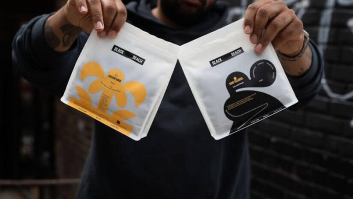
Cina’s final design for Black Beach Coffee’s The Golden Hour blend features a creamy yellow flower, and the Kind Regards blend showcases a black, abstract shape, with both images set against the white backdrop from the bag.

“[While] it was abstract, it still did communicate [the brand’s artistic values]. And the other one was a [flower] with typography in it, which was a little bit more fun and playful,” which reflects the brand’s commitment to art accessibility for all, Cina said.
This cost-effective solution allowed Black Beach Coffee to maintain design flexibility and consistency, enabling it to expand its visual identity, build recognition and loyalty, and stand out from other coffee players.
“We came up with a system that could be expanded upon. … We can add to the lexicon. For different coffees, you can add different iconography and it can work as a whole system altogether," he said.
Cina emphasized how packaging and design limitations can often pave the way for a more innovative approach, highlighting how small brands, like Black Beach Coffee, can succeed with adaptable and scalable packaging solutions that do not compromise design integrity.
“When a company is starting out, they do not have a lot of headway to invest in packaging. So this was kind of a perfect solution … to get them off the ground into the next stage. … But it took hard work to get there,” he said.
Cina pointed out packaging and design can convey a brand’s message, but the brand “has to do the rest” to deliver product that delivers on taste and quality as well.
‘More than just pretty pictures’
Semiotics, the visual language of design, is an integral part to the branding process that combines various design elements like typography, symbols, color, images, layout and form to help brands create coherent narratives that influence consumer perception, Cina explained.
Adding these elements together “create what I would call ‘perception,’ … to create a familiarity or a communication of what the brand is trying to emote. It is more than just pretty pictures. It involves strategy. And that is what ... really impacts people’s perceptions and impulses,” Cina said.
Outside of design, semiotics as a form of communication that many people understand as well, Cina said. According to a survey from YouGov, about one-third of Americans are able to visualize an image clearly and vividly. For brands, developing a design strategy that resonates with their narrative is crucial, as consumers easily detect when something is off, he added.
“If you understand visual communication … that is what helps storytelling and capturing what a client wants to achieve. And really, an effective design would combine storytelling strategy in a creative bubble while also … achieving goals and desires,” he explained.
He added that a strong visual language is more than “influencing behavior” and more about “being authentic and helping a company really, truly communicate what they want to say.”